
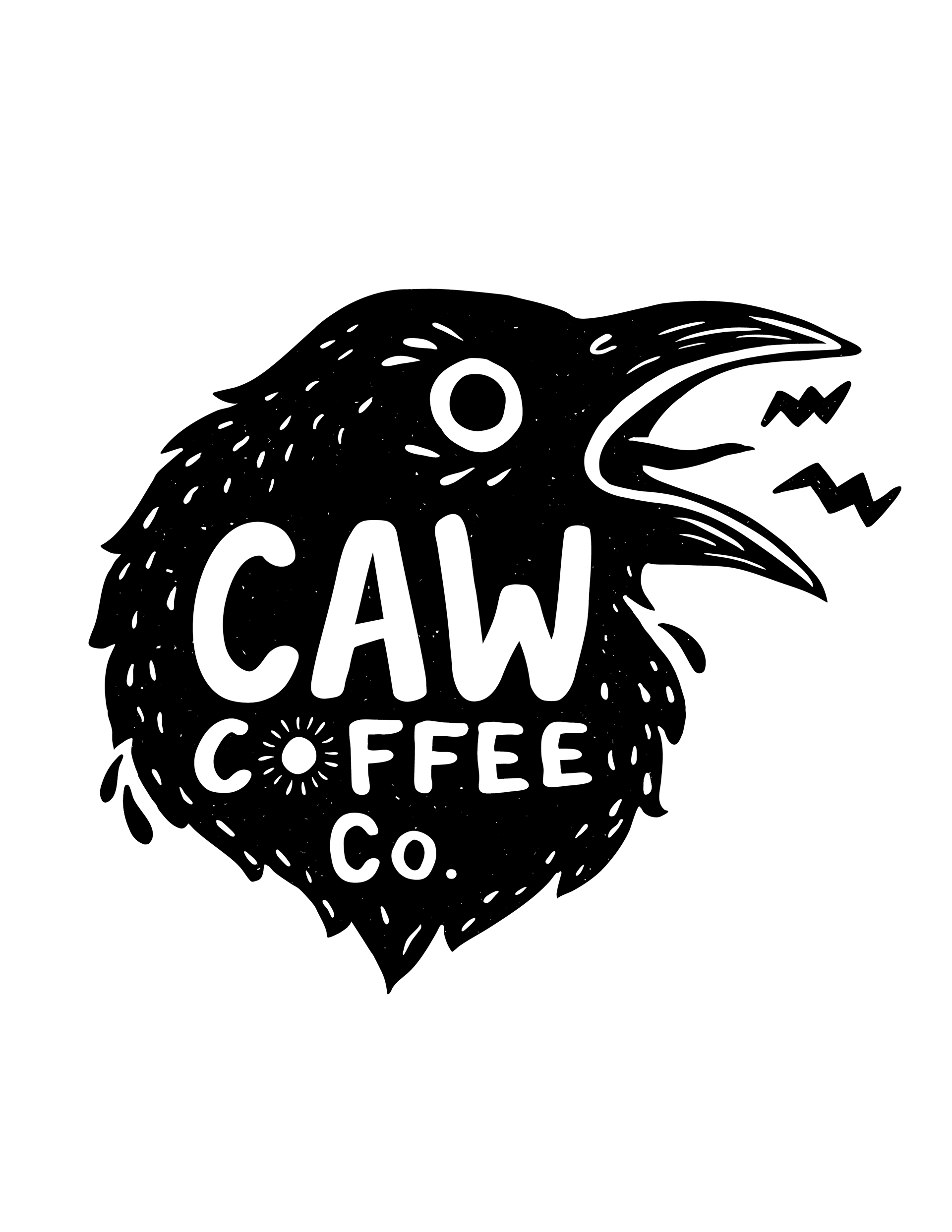
CAW Coffee Co. is an Atlanta-based food truck coffee concept with a visual direction rooted in folk and Americana-inspired artwork. The client came to me with initial hand-drawn artwork and a clear vision for the brand’s overall tone and aesthetic.
My role was to refine and formalize the existing concept into a cohesive, usable brand system while preserving the hand-crafted quality of the original artwork. I identified a typeface similar to the client’s original lettering and customized key letterforms used throughout the logo to maintain a hand-drawn feel while improving legibility and consistency across applications.
logo variations
Three logo variations were developed:
• A textured version inspired by the client’s original carved print, referencing block printing and screen printing techniques
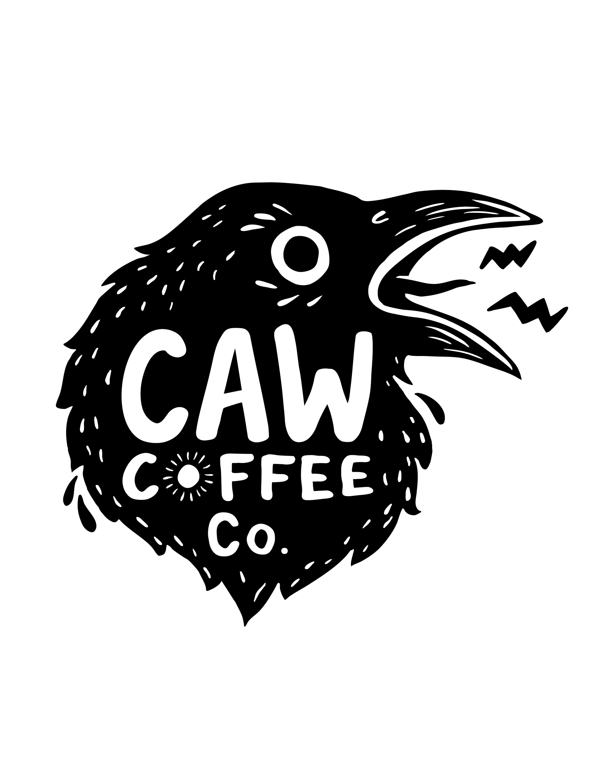
• A clean black-and-white version for versatile, high-contrast use
• A wordmark-only version for flexible brand applications
The primary logo variations include an illustrated element based on the client’s original drawing, with the overall identity drawing from folk and Americana visual traditions.

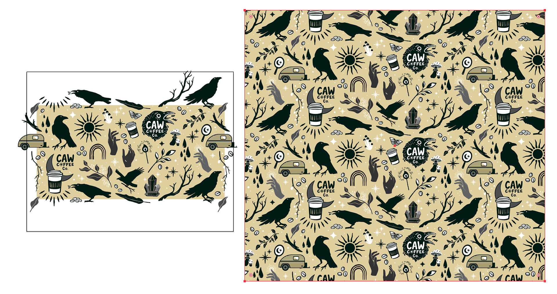
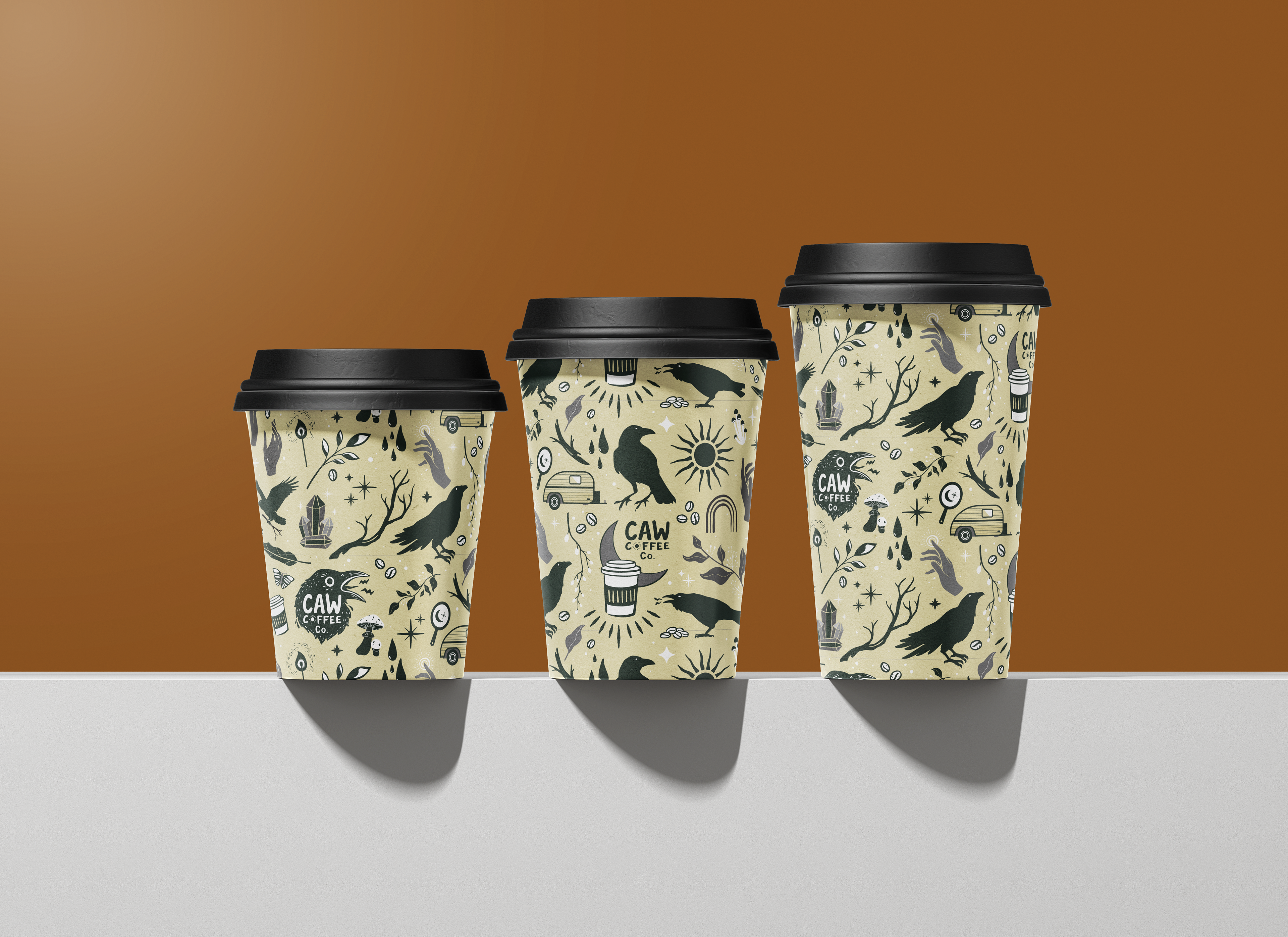
pattern design
Following logo approval, I designed a repeatable pattern intended for coffee cups and future brand materials. With minimal existing brand guidelines, I was given creative freedom to expand the visual language into a cohesive system. The pattern was designed to be scalable and reusable across menus, packaging, and other printed materials as the brand evolves.
The pattern became a foundational part of the visual identity and remains a highlight of the project.